Aware health
Aware Health is a startup focused on creating physical therapy programs for employees.
Challenge
Aware Health wanted to create more informed benchmarks of success when using their program. In order to do so they needed to collect more information from their users. Their strategy was to send out a marketing sweepstakes email with a form to collect more information. They planned to send out this form quarterly and incentivize users with an opportunity to win a gift card.
Goals
Three iterations of a form landing page within 2 weeks.
Develop a page where the primary objective was to collect information.
Collaborate with the developer to create a page.
Follow the guidelines of the developed design system.

Halfway through the iterations, the scope of work changed. The primary objective of the landing page was for users to complete a form however, during the review of the second iteration the client mentioned they intended to present this landing page to its board as a promotional piece as well. Typically I try to stay within the scope of contracts however since I had already been working on different iterations it was easier to provide alternatives for my client.
Results
Two Iterations

First iteration
For the first iteration, I provided two different low-fidelity options to understand what direction the client wanted. During this meeting, I presented the user task flow to create alignment moving forward.
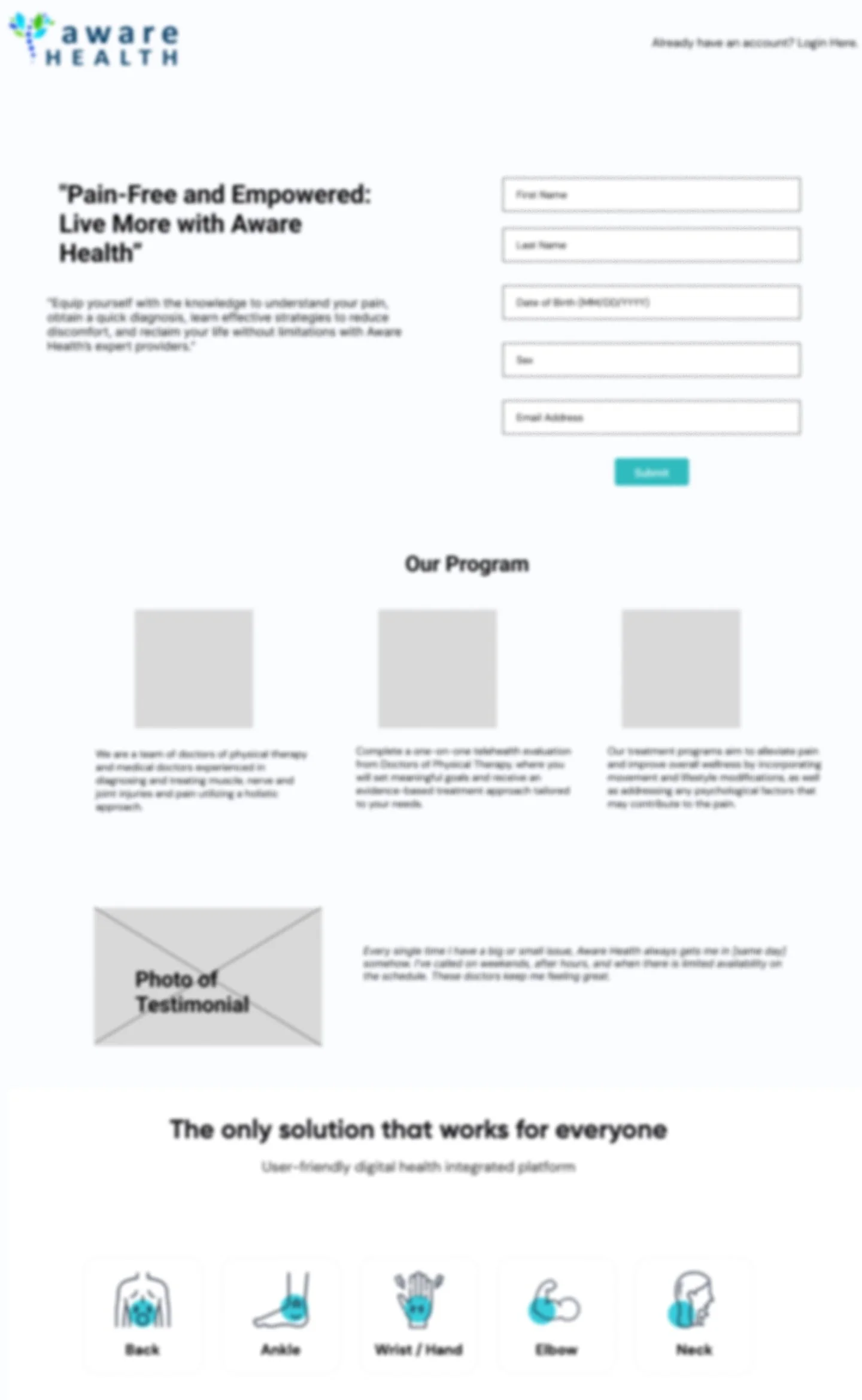
After receiving confirmation of the user task flow the client asked that the Form First landing page be further explored.
By putting the form above the fold on the page it provides the user with a clear direction and when sent via email, users would also be provided the proper context and objective of the form.

Second iteration
After the first review, I spent time creating a more high-fidelity wireframe and further developing the content of the remaining part of the page. The client wanted there to still be an opportunity for the user to explore and learn more about Aware Health.
During the second review, the client requested the visual image be less prominent and more text be provided for the form. Upon further questioning, it became clear the objective of the page had somewhat changed during the last few days.
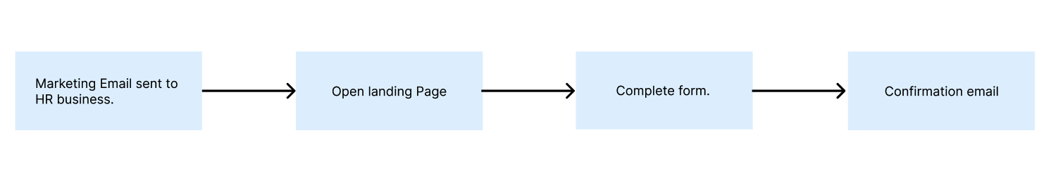
User Task Flows
In order to create alignment with the team, I developed a basic task flow for the team to review. This helped ensure that the purpose of the page was clear to the client but also to users. Users were meant to encounter the page in a marketing email that would provide a sufficient amount of context for the form.